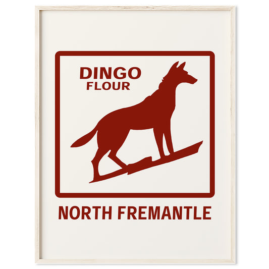
For many people in Western Australia, the Dingo Flour sign is simply part of the landscape. It stands above North Fremantle in bold red capital letters, visible from Stirling Highway, passing trains and the sandy beach. Over time, it has shifted from a commercial rooftop sign to a cultural marker, something that signals arrival, memory and place. It has also inspired artists who reinterpret the landmark in contemporary formats, including our Dingo Flour print, which captures its bold geometry and industrial character.
The Origins of Dingo Flour
Dingo Flour traces its roots back to the late 1800s, when flour milling was a critical industry in Western Australia. As wheat production expanded across the state, local mills became essential in processing grain for both domestic use and export.
The North Fremantle mill site has operated since the early 20th century, positioned strategically near the port and rail lines. Fremantle’s role as a trading hub made it the natural home for large scale processing facilities, and flour was one of the state’s key agricultural products.
Over time, Dingo Flour became one of the most recognisable household brands in Western Australia. The name itself drew on an Australian native animal, aligning the product with national identity at a time when locally produced goods were a point of pride.
The Design and Construction of the Sign
The rooftop sign that dominates the skyline today was installed in the mid 20th century, when large illuminated signs were a common way for industrial companies to assert their presence.
The Dingo Flour sign was designed in bold, block capital letters, prioritising legibility over ornament. Its simplicity is part of its longevity. The clean sans serif style and strong red colouring ensure it remains visible from a distance, even against bright coastal light.
The structure itself was engineered to withstand Fremantle’s coastal conditions, including strong winds and salt air. Over the decades it has required maintenance and refurbishment, including updates to lighting technology. Originally lit using traditional neon tubing, parts of the sign have since been upgraded to more modern systems while retaining its original visual character.
Unlike many heritage signs that were removed as cities modernised, the Dingo Flour sign endured. Its continued presence is tied to the fact that the mill remains operational, giving the sign an ongoing functional and symbolic role rather than reducing it to a purely nostalgic relic.
A Symbol of Industrial Fremantle
Fremantle is often associated with heritage buildings, maritime history and creative culture. The Dingo Flour sign adds another layer to that identity. It speaks to the city’s working port roots and its role in feeding a growing state.
While much of inner Fremantle has shifted toward hospitality and residential development, the presence of a functioning mill reinforces the suburb’s industrial foundations. The sign, large and unapologetic, acts as a reminder that before boutique storefronts and lifestyle branding, Fremantle was defined by trade, grain silos and shipping lanes.
Why the Logo Still Resonates
In an era when corporate branding is frequently redesigned and simplified, the Dingo Flour logo has remained largely unchanged in spirit. Its endurance gives it authenticity. It was not created to be retro or as public as, yet it now feels historic and has become part of the WA cultural landscape.
For locals, it often represents continuity. Generations have grown up seeing the same red letters against the sky. That repetition builds attachment and embeds the sign into Perth’s collective memory.
It is one of several Australian industrial and travel icons that continue to shape how we see place and identity. If you are drawn to landmarks that define a city’s character, you can also explore our Australian Landmark Prints collection, which highlights other recognisable scenes from around the country.
The Dingo Flour sign is not just an advertisement for flour. It is an example of how industrial branding can evolve into cultural heritage. Through time, function and familiarity, it has shifted from commercial signage to an icon embedded in Western Australia’s visual identity.